Sloane
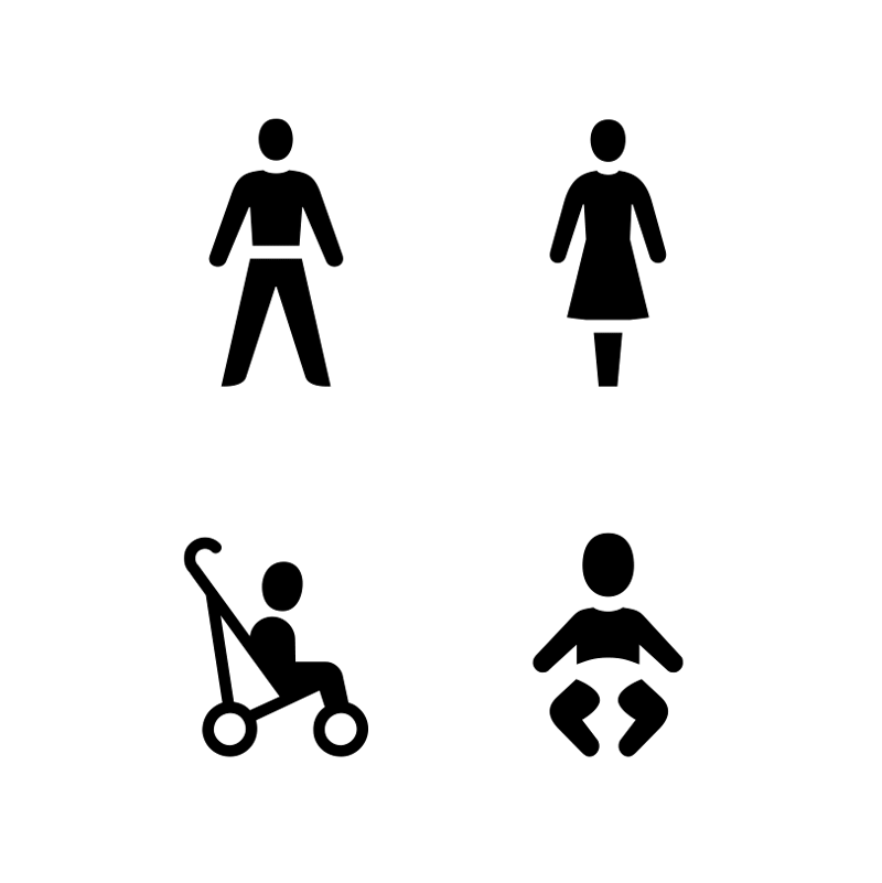
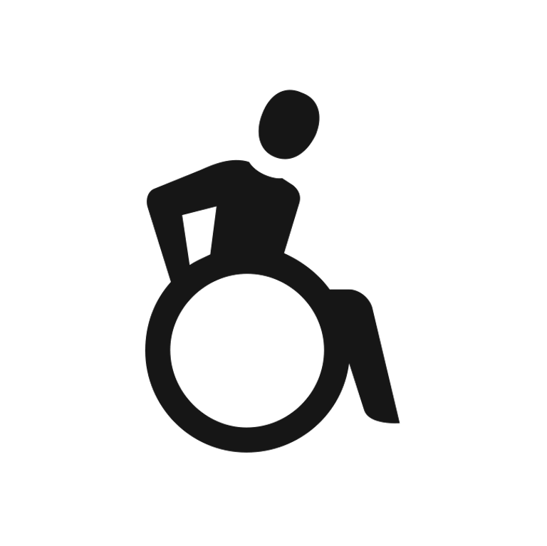
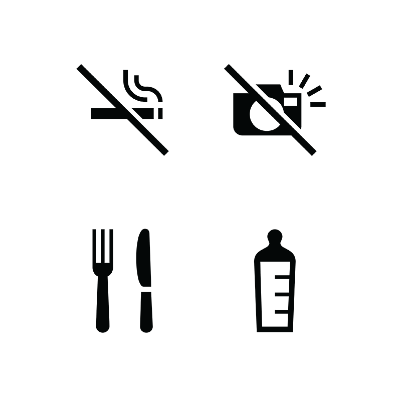
The British Museum has one of the world’s largest collections, displaying over 50,000 artefacts in an exhibition area of over 75,000 square metres. In 2006, the museum undertook a massive upgrade to all maps, wayfinding and signage systems.
As part of this, I was commissioned to look specifically at the museum’s pictograms, with two key considerations in mind. They had to work together as a whole so that they looked harmonious and part of the same family when they appeared next to one another. They also needed to work at vastly different sizes, from only about 12mm on the printed map to a quarter of a metre high on signage.
To achieve this, I paid particular attention to the negative spaces around each pictogram. I optically adjusted the amount of black in each pictogram to maintain an even tone across them all. I also made a Python script that measured the percentage of black to white in each pictogram.
The final set of 42 was made into a typeface so that all the different staff and contractors could apply the pictograms using the same borders, spacing, and clear space. This typeface is named Sloane after the architect of the original building.
Designed by Betsy for Lucy and Robert Carter